The inexperienced user: homework meets tech content
Some introductory words about myself for you to catch up with the following story … I am both a tech writer and a content creator, working remotely for our small IT company. My assistant role also includes some administrative tasks and first-level customer support. However, there is one role in my life which seems even more challenging, but great . My husband and I have two wonderful daughters. While the “little one” attends kindergarten, the “big sister” has turned into a school kid this summer. And she has got something in common with a very inexperienced user of hardware and software products.
. Sometimes, she just does not understand her abstract homework. This means that she does not get the touchpoints she would need to transfer these tasks to her daily life. Like many users out there who clearly prefer WYSIWYG solutions, my daughter sometimes refuses to look beyond the surface of her homework sheets. Thus, she often fails to create logical connections at first. By the way, this “abstraction issue” is a very common thing among young children. Especially among those who might have needed one more kindergarten year.
“Mum, I don’t get this task!”
Until lately, “houses of numbers” had it in themselves to turn my girl into a drama queen. For an adult, there’s a simple thought behind this sort of school task. You’ve got a number (e.g. 10) and a combination of numbers on each side of the table which result in the named number when you add them up. However, for my six-year-old this logical connection was not available in her mind filled with princesses, unicorns and Barbie dolls. So it became necessary for me to dive into some “user experience understanding”. With this knowledge, I then had to create a learning model which my “inexperienced and unmotivated user” likes and remembers.

First step: Get to know your user target group!
Seeing my little girl’s helpless and fearful reaction to uncommented, abstract school tasks, I started looking for touchpoints with my “target user”. What was she interested in, what could she imagine well and how could I motivate her to get involved in this learning process? I ended up with the conclusion that it had to be a playful scenario focussing on Barbie, princesses and “something to touch”.
Second step: Create a prototype!
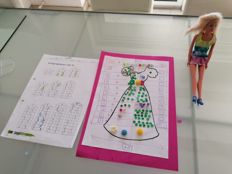
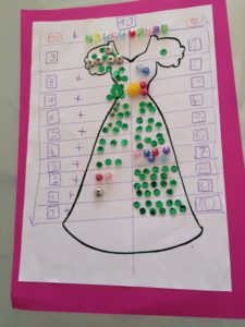
So what could it be that motivates my school girl to dedicate herself to logical mathematical combination? I know that she likes inventing her own stories, creating small artworks with paper and everything that glitters and naturally her shiny little Barbie world. So I created a “number ball gown” prototype in which she was supposed to arrange shiny pearls in certain combinations. The “number ball gown” is based on a simple printout of a colouring page and pearls in different colours. I then divided the gown into the same sections as in the most difficult “number house”. This overall structure includes all combinations from 0 to 10. In my technical writing course, I had learned to lower the abstraction level to the potential user’s experience level and to stay close to his or her user requirements. So the Barbie dress was the best possible instruction match.
Third step: Involve the inexperienced user!
My instructor at tech writing training had always advised our class to “stress the user’s purpose when reading or consuming technical content”. With a wink, she had always noted that “when your target user has to think too much, there’s still room for improvement”. We had also talked about clear document and linguistic structures and the extremely short attention span of people in a digitalized world.
So the IT principle “KISS – keep it short and simple” definitely makes sense in tech documentation for users at lower experience levels. And it also does with kids who have issues finding interest in abstract tasks! We thus needed a good reason, a “purpose”, to get started with the number ball gown. So I told my girl that Barbie needed her help to create a new, pearl-decorated dress for her friend. “She” wanted to embellish a ball gown with an exact concept and decoration pattern. After some colour choices, reading numbers, counting pearls and sticking them to the plain dress design on both sides of the division line, we were ready. Finally, I could congratulate her for her efforts and beautiful results.
Fourth step: Create an intuitive concept!
So, after this extensive user experience test, my daughter and I took a short break, drinking a mug of hot chocolate. Why do I mention such a profane thing? Generally, learnings take time and some rest to stay in the user’s mind. And both of us had gone through a great learning experience – me on a pedagogical level and my daughter in the cognitive sector.
After our learning break, we “standardized” the chronology and connections of numbers. Then we compared the “number ball gown” to the “house of numbers” on her latest homework sheet. She could see that all combinations were the same and knew how to “read” the arrows and chronology. Just like the first-time user of a software or device who intuitively starts to see the overall parallels in product use. Naturally, experience is still a key competence to get used to formerly unknown functions and features. And my daughter will have to fill in a lot of “number houses” to get into a real routine. But at least, she now has a valid, target-oriented “user guide” to check on when she needs a reminder.
Fifth step: Document and evaluate your user experience results!
“If a user information piece shall remain helpful for the target group, you must revise it at times and get some feedback.” This was another advice from my tech writing instructor. In my daughter’s case, I got the positive feedback very fast. Two days later, she took home another sheet with “number houses”. But this time, the task went a lot easier.
My daughter had taken some photos of her Barbie sitting next to the number ball gown and of the gown itself. Being proud of her creative work, she had given one printout-copy to her teacher. Later that day, she told me that “the number gown had really helped her” to understand this task. And this time, it was me who felt a little proud of herself. Just because I had found a correct way to make my “target user” accept and understand my instructions. For my daughter’s further “user experience” with school tasks, I know that creative and playful methods work very well.

User experience is everywhere!
So, why do I tell you a rather private story to talk about user experience (short: UX) and instructional content? I do so because, in my opinion, our complete life is a long-term user experience. That’s why it is so important to include user experience elements and target orientation in all documentation processes and technical content. Before you start writing, cutting or organizing, you should always know your audience. For a technical writer or a content creator in general, it is just crucial to be understood. This is only possible if we dare to understand our target groups and to ask for feedback.
